
01
Home

02
Services

03
Cases

04
About Us

05
Careers

06
Blog

07
Contact Us
01
Home
02
Services
03
Cases
04
About Us
05
Careers
06
Blog
07
Contact Us
Ask for a free consultation now
A product page that converts 18% better, across more than 35,000 tested sessions.
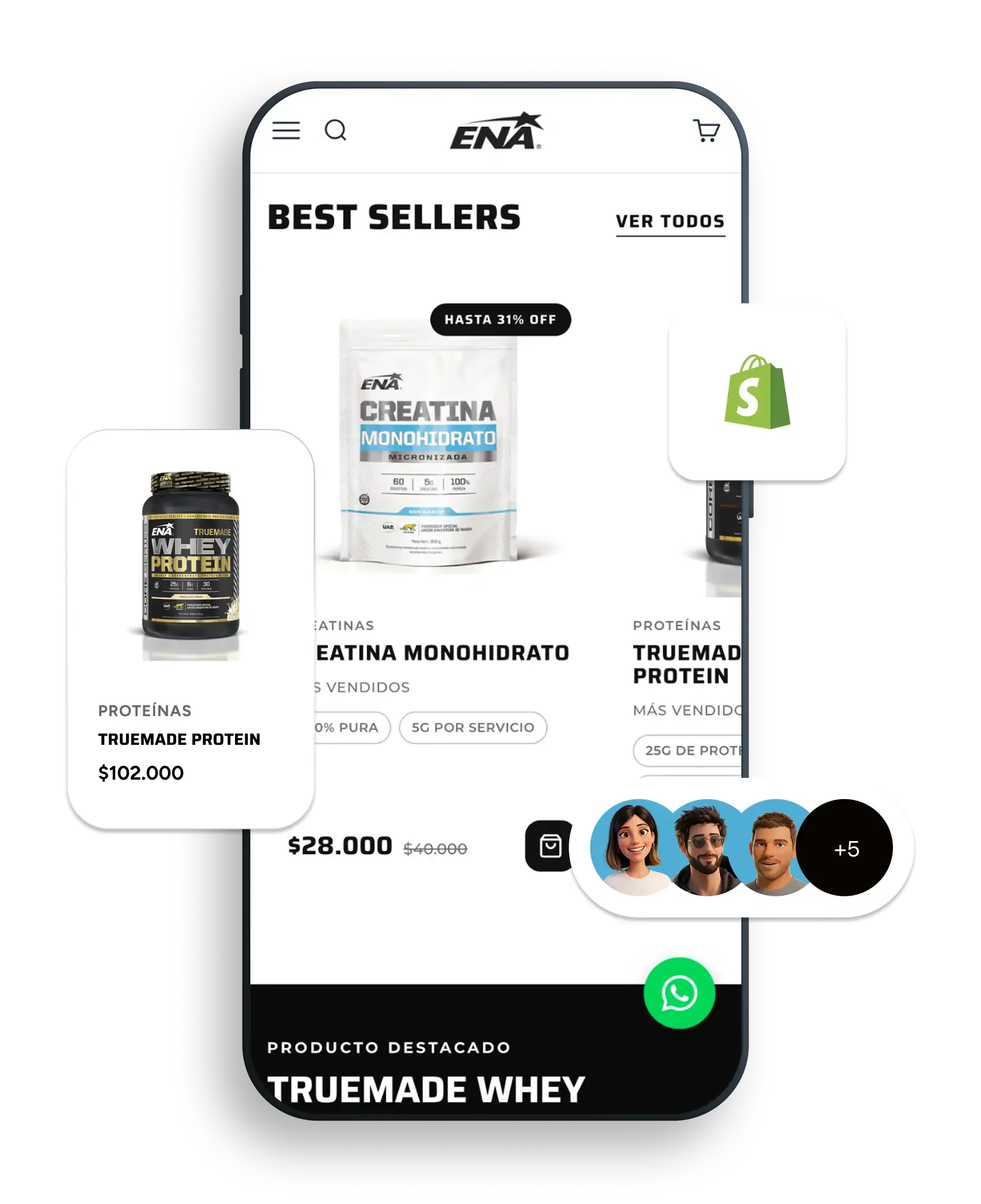
An end-to-end redesign of Home and PDP, built so the purchase decision happens in seconds.
ENA Sport is a leading sports nutrition and supplementation brand in Argentina, with a technical catalog and a direct-to-consumer model that needed to meet global-market visual standards without losing speed or clarity in the purchase decision.
PDPs carried too much friction, navigation lacked hierarchy, and visual assets did not communicate the technical value of each supplement. Shoppers hesitated between formats and sizes, and the path to purchase was longer than the business could afford.
End-to-end UX/UI redesign of Home and PDP under a mobile-first approach, with a modular system built to scale across future launches, renewed art direction for product assets, and aggressive performance optimization.
For a brand like ENA Sport, a reference in sports nutrition and supplementation in Argentina, the product page is not just another screen: it is the moment the shopper decides. And that moment was loaded with noise.
In the previous version of the store, the PDP accumulated information without hierarchy. What a shopper in this category needs to decide in seconds was missing: how many servings a container holds, how long it will last, how to use it, what direct benefit it delivers against a specific training goal. The outcome was predictable: users bounced between formats and sizes without fully understanding what they were comparing. Friction was not a visual detail, it was a cost the store paid every single day.
The problem did not sit only on the product page. Navigation into the catalog was not helping either. The menu lacked visual hierarchy to surface key categories, and tactical opportunities for cross-selling and featured products stayed invisible. Product assets were limited to showing packaging, when the category demanded something else entirely: pieces that communicate seals, ingredients and functional benefits in a single glance.
On top of that was the operational friction of deep scroll without persistent calls to action, and a mobile performance penalized by heavy multimedia assets. Every layer of friction was a conversion leak, not a cosmetic issue. ENA's e-commerce needed to stop being a storefront and start being a transactional platform with real visual and functional impact.
The response was rebuilding the shopping experience from the ground up. The new PDP was architected as a modular, scalable system so every future launch reuses the same logic: a sticky Add-to-Cart that stays present on both mobile and desktop, a format selector with dynamic pricing and volume discount tiers in plain view, information blocks that condense essential consumption data, direct recommendations aligned to training goals, and native upsell and cross-sell modules integrated into the PDP flow.
In parallel, the Home was redesigned with a hierarchical mega menu that organizes categories, goals, and reserved slots for featured launches, plus quick-access modules to the main product lines. Art direction took a full qualitative leap: new assets were produced as visual infographics that condense technical specs, certifications and functional benefits at a glance. Judge.me was integrated with custom styling to align reviews and ambassador content with the brand's look and feel, and aggressive image and video optimization with lazy loading secured ultra-fast response times without compromising audiovisual quality.
The redesign was validated with a balanced A/B test over more than 35,000 qualified sessions: 17,728 sessions on the new variation against 17,428 sessions on the control. The gap was clear and sustained: the variation converted at 0.59%, against the control's 0.50%. A relative lift of +18% in conversion rate, on a traffic base large enough to rule out noise.
The number that mattered to the business, though, sat one layer deeper: that growth in direct sales was achieved holding qualified traffic volume steady. No extra traffic was bought to convert more. A product page was built to close the sale better. The new visual and front-end architecture did not just move the number today, it left a modular foundation on top of which ENA can keep adding launches, formats and variants without having to rethink the shopping experience each time.

